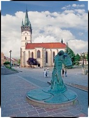
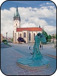
Image with rounded corners (using CSS3)
W3C added nice new options for creating rounded corners of elements to their CSS3 working draft. Engines like Gecko, KHTML and WebKit already implemented these functions, but they use vendor prefixes in the keywords (-moz-border-radius, -khtml-border-radius and -webkit-border-radius respectively), because the feature is not yet fully standardized. That’s also the reason why Opera and Internet Explorer decided not to implement this extension for now.
I was playing with the rounded corners and I like this feature a lot, but I also hit one problem (in all 3 engines). When you use the border-radius with an img element, the image is drawn above the border, so it isn’t rounded (top example). Fortunately, the effect could be easily achieved by rounded div, setting its dimensions exactly to the image size and using the image as the div’s background (bottom example).

<img style="border: 2px solid black;
            border-radius: 30px;
            -moz-border-radius: 30px;
            -khtml-border-radius: 30px;
            -webkit-border-radius: 30px;"
            src="presov.jpg" />

<div style="border: 2px solid black;
            border-radius: 30px;
            -moz-border-radius: 30px;
            -khtml-border-radius: 30px;
            -webkit-border-radius: 30px;
            width: 180px;
            height: 240px;
            background: url('presov.jpg');" />
Update#1: I reported the issue to Gecko, KHTML and WebKit bugzillas.
Update#2: Dave Hyatt closed the WebKit bug with the comment: “This was fixed recently.” \o/