Emailplot - chart your email activity
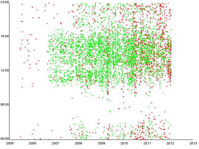
Today I stumbled upon this fascinating article called The Personal Analytics of My Life by Stephen Wolfram. I immediately started to write my own script which produces the first chart in the article - daily distribution of sent emails.
You can fetch it from my misc repo on github and play with it (requires ruby and rcairo). Output for my outboxes looks like this (red dots are personal emails, green ones are related to openSUSE):

I might implement other charts mentioned in the Stephen’s article in the future, but no promises. :)